You didn't get Flamegraphs
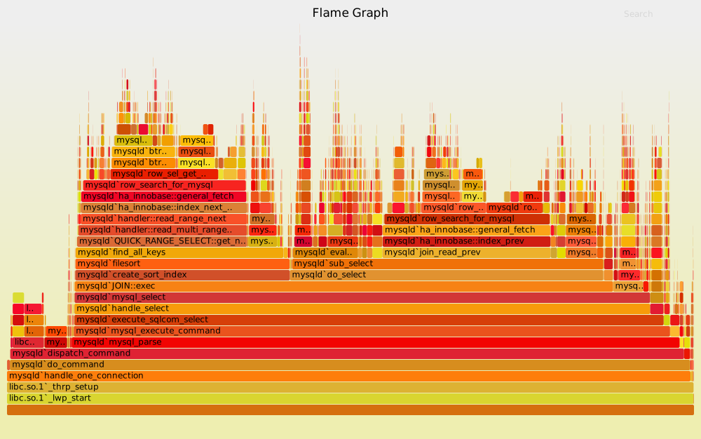
You didn’t get Flamegraphs
snpefk/gha-flamegraph: Flamegraphs for GitHub Actions
A week ago I “wrote” a Flamegraph renderer for GitHub Actions tailored to my needs, because my job involves doing optimization work for afromentioned GitHub Actions.
Before you grab yout pitchforks, I had to warn you that I vibe-coded the PoC with clanker, but then rewrote it into a blazingly fast version in Rust. What do you do with all the free time you’ve saved, besides coming up with clickbait titles? Obviously, you dive deeper into the topic.
How it works
Let’s start with the foundation on what a Flamegraphs build and what it is.
It’s a visualization of Stack Traces. What are Stack Traces? They’re a sequence of Stack Frames representing the current (Call) Stack (I won’t explain what a stack is).
In simplified form, it can be represented like this:
fn foo(a: i32) {
    println!("Y = {}", a)
}

fn bar(x: i32, y: i32) {
    println!("X = {}", x);
    foo(y);
}

fn main() {
    bar(1, 2);
}
If you collect samples (we’ll talk about that later) during execution, it looks like this:
main;bar;foo 10
Where:
main,bar,fooare frames (the call chain),10is the number of samples (or the “weight” of this stack).
These are exactly the kind of lines that are typically fed as input to tools like FlameGraph. The hardest part is actually extracting these frames (via profiling tools). We won’t touch on that part here.
With enough imagination, you can represent pretty much anything as stack traces. I, for example, figured out how to represent a GitHub Actions workflow in this format.
History and Theory
It seems like they’ve been around forever. In reality, it’s a relatively recent thing: Brendan Gregg introduced Flame Graphs around 2011–2012, and the first implementation was in Perl.
Personally, I had been misunderstanding how to read Flamegraphs this whole time. The X-axis is not time. It’s aggregated and sorted stack traces (identical stacks collapsed together). If you try to plot the graph over time, you get a hair graph – a noisy visualization where it’s nearly impossible to see patterns. The whole idea behind Flamegraphs is the opposite: identical stack traces are merged, the X-axis order is chosen so that neighboring stacks are similar (usually lexicographic sorting), and thanks to this, “wide” hot spots are clearly visible.
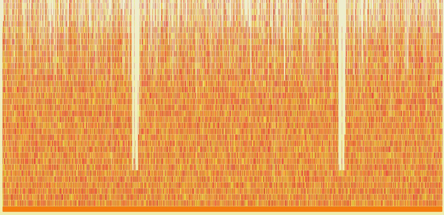
A graph where the X-axis represents time is a Flame Chart. If you’re like me, it might comfort you to know that early profilers in Google Chrome also initially produced exactly that kind of graph.
The naming is also amusing. FlameGraph has an “inversion mode” — the icicle graph (with leaf merge), and without a picture it’s nearly impossible to understand what that means: a regular Flamegraph grows upward, while an icicle graph grows downward, like, well, “icicles.”
There’s also a Differential Flame Graph — a mode for comparing two profiles. But Brendan Gregg himself doesn’t use them; he just opens two Flamegraph tabs in the browser side by side and quickly switches between them with his eyes. The best performance engineer on the planet, ladies and gentlemen. In general, his talks give great insight into how someone like that works: for example, when adapting for the JVM, they wanted to highlight native and Java stack traces in different colors. He solved the problem in “two minutes” by writing a regex (based on the name format – Java names often contain /), and that was good enough.
Finally, about sampling profilers. I only now properly understood what “sample-based” profilers actually mean (after reading “Systems Performance” it wasn’t that obvious): the profiler captures the stack trace of the current thread at a given frequency, and then aggregates these samples. Importantly, the frequency is often chosen to be a non-round number (e.g., 97 or 113 Hz) to avoid synchronization with periodic events in the program (polling loops, timers, etc.). If the frequency “coincides” with such a cycle, the profile can end up skewed.
That’s all. Star the repo on GitHub, write your fact-checks in the comments.